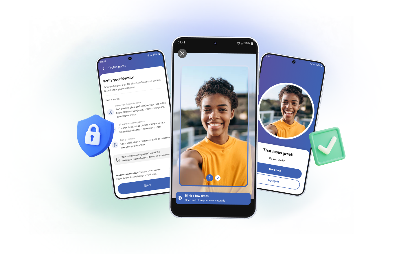
Problems
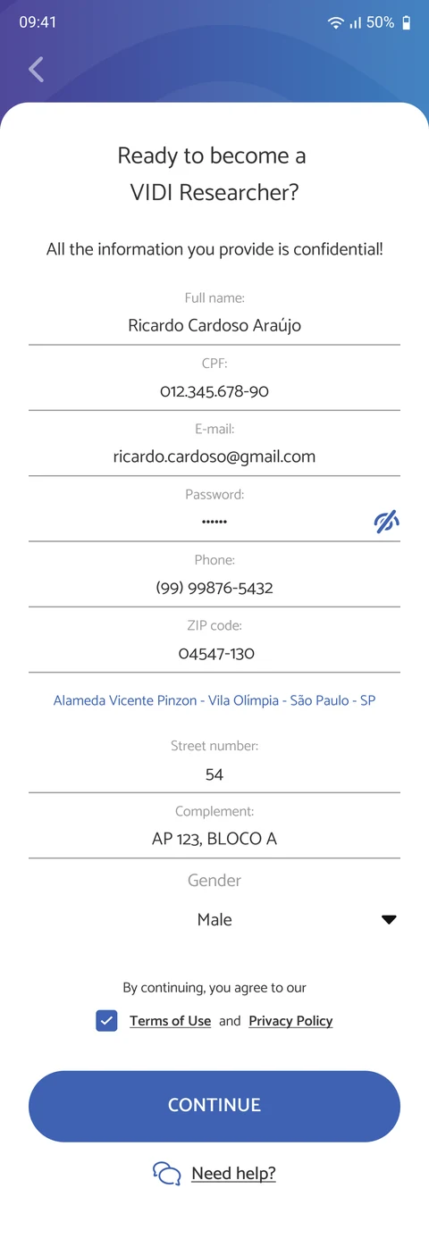
Sign-up asked for everything upfront, in one long form. 99% of downloads never became accounts.

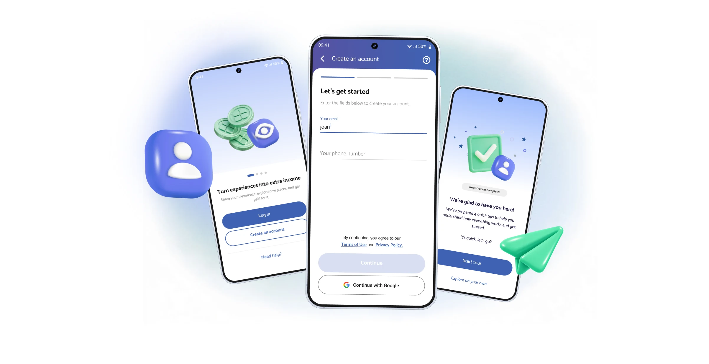
VIDI pays people to work as mystery shoppers and store auditors: a side gig, like driving for Uber, but done inside real stores for Brazilian brands.
The app had no trouble getting downloaded. The trouble was what came next. Out of roughly 1,000 daily downloads, about 10 people finished signing up. The first screen alone lost 80% of them: a long, scrolling form with 10 fields, followed by terms, extra personal questions and a selfie.
But we couldn’t just delete the form. VIDI runs on trust: brands pay for real visits from real people, so we genuinely needed identity data to prevent fraud.
The challenge was asking for a lot, without it feeling like a lot.
Sign-up asked for everything upfront, in one long form. 99% of downloads never became accounts.
Phased the process: essential data first, broken into short steps that explain why each item is needed. Everything else moved to post-sign-up profile completion. Added Google sign-in.
Daily sign-ups went from ~10 to ~700: completion grew from 1% to 70% of downloads.
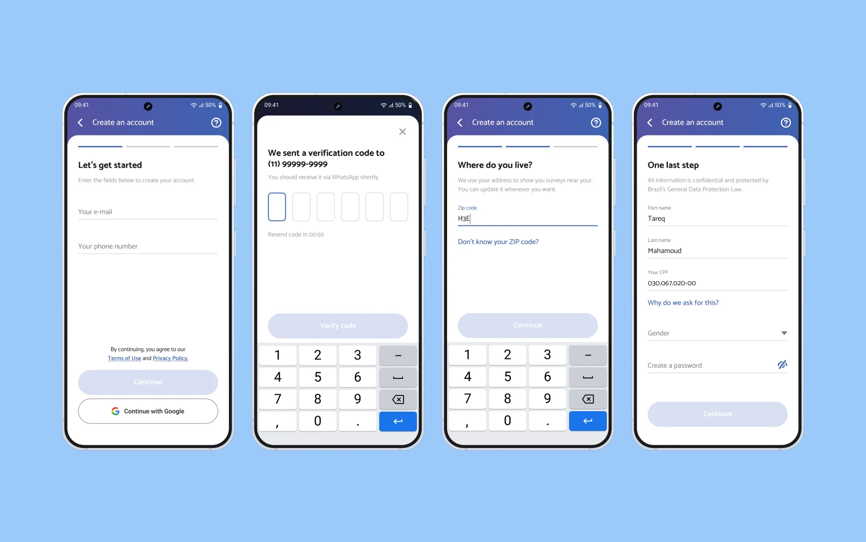
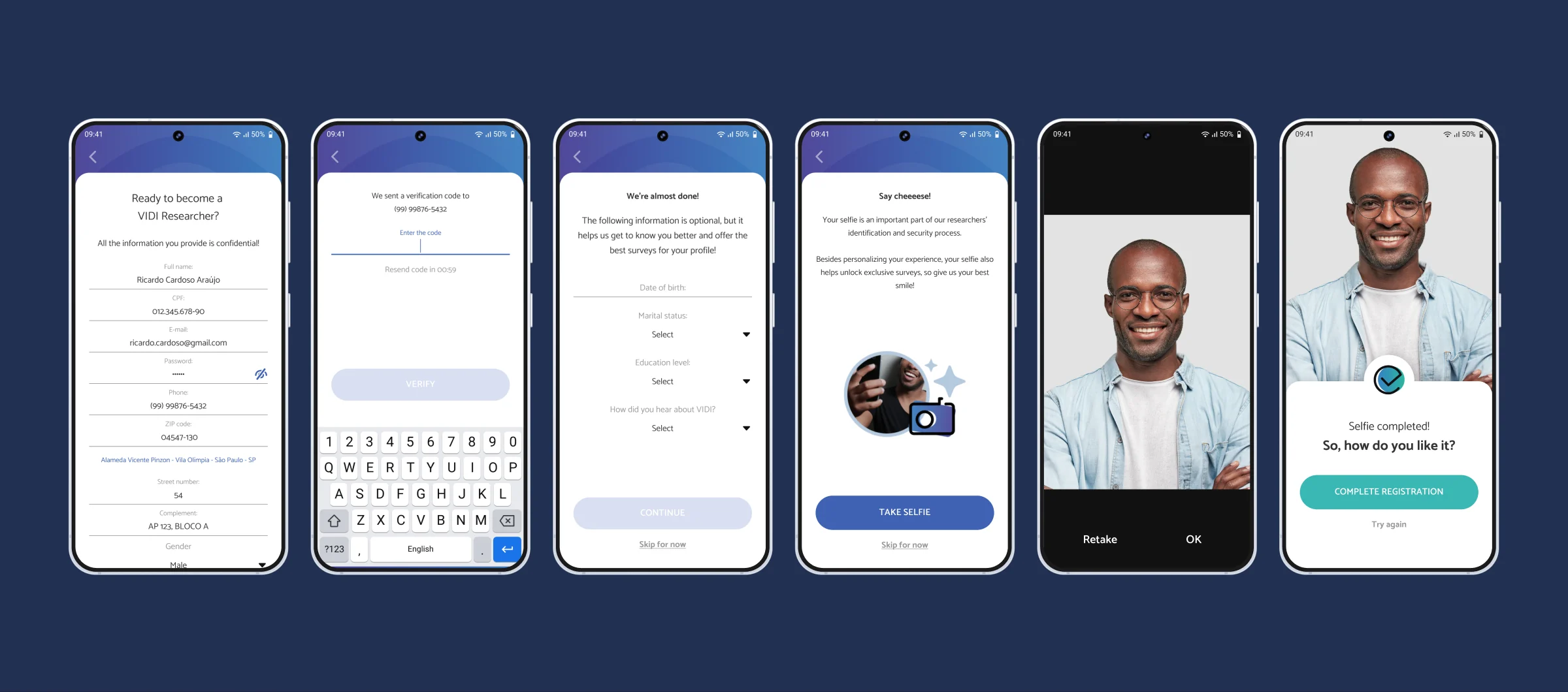
fig 1. old sign-up vs. phased sign-up — drag to compare

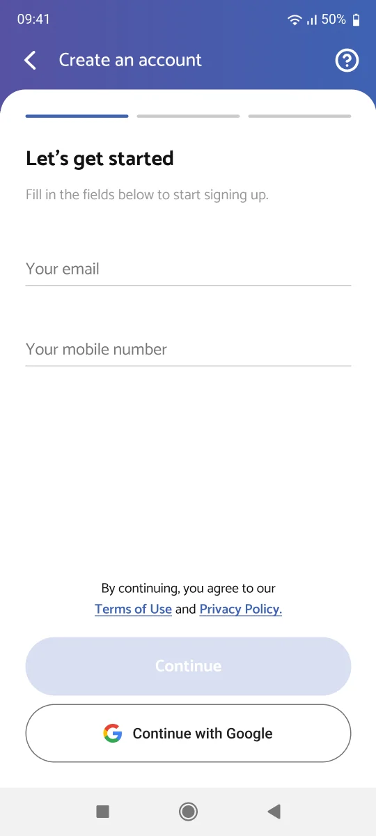

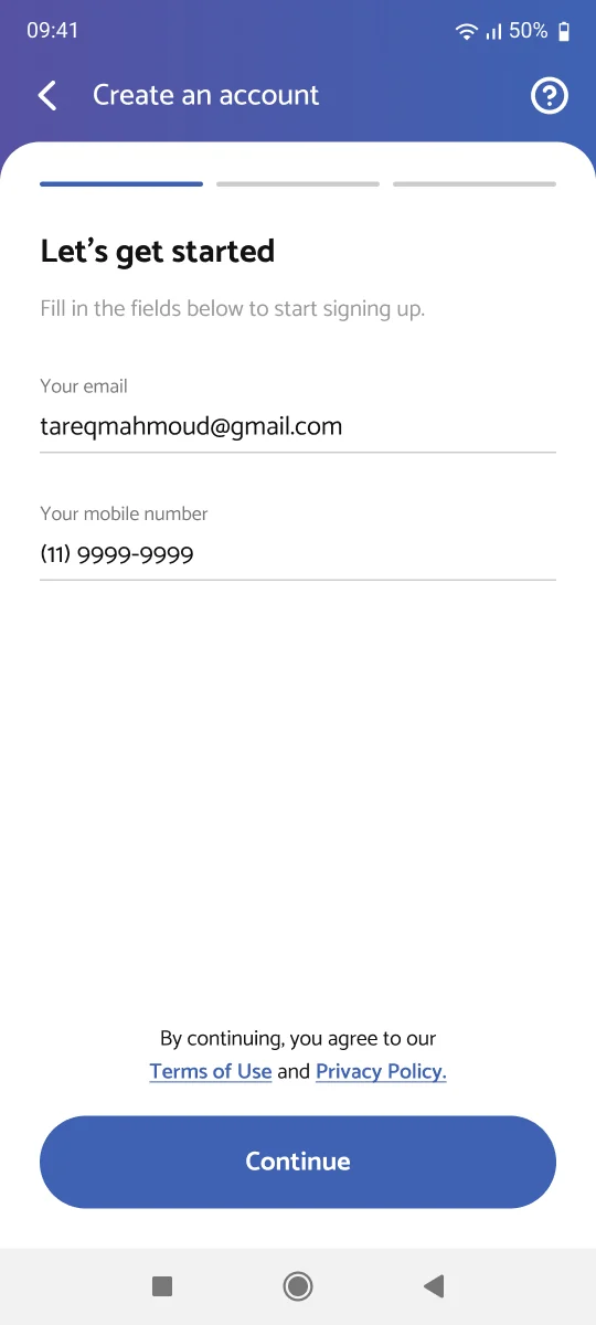
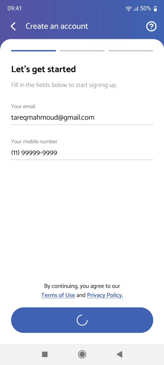
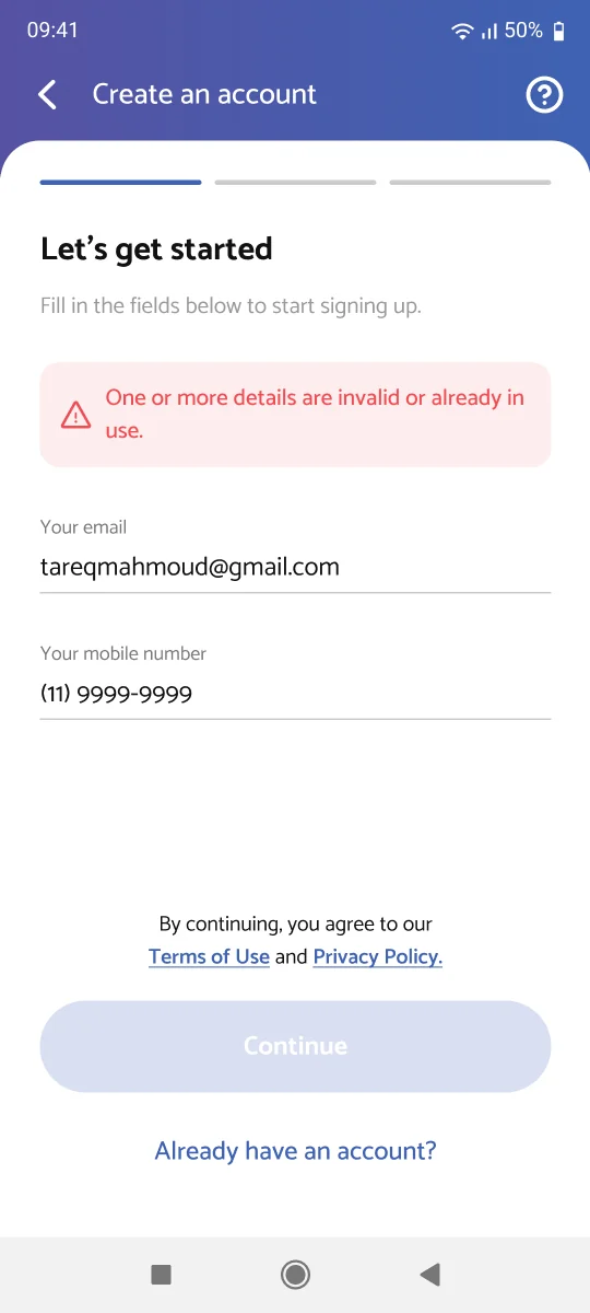
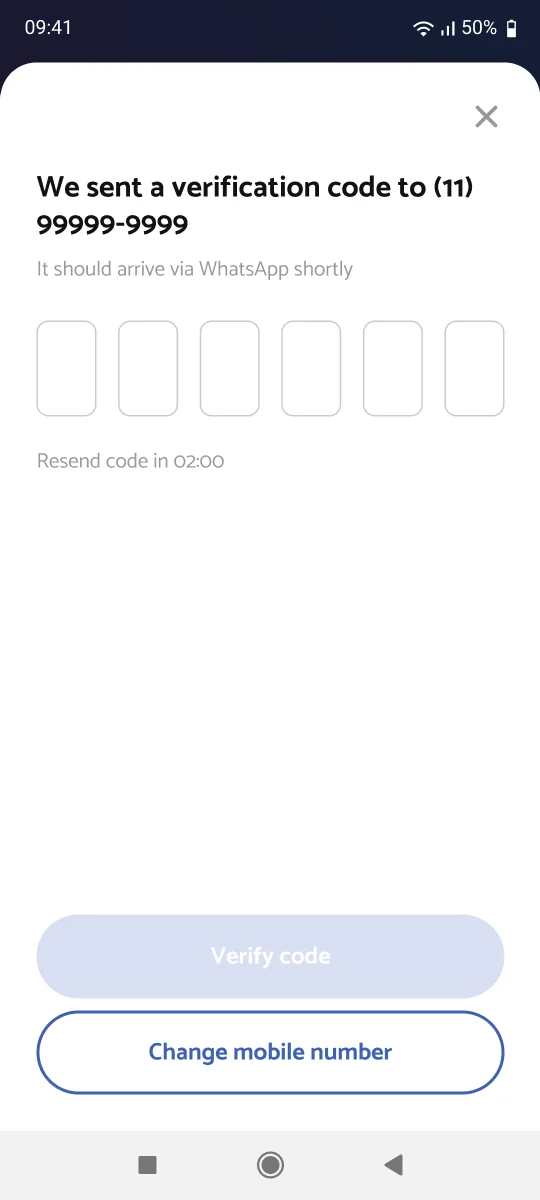
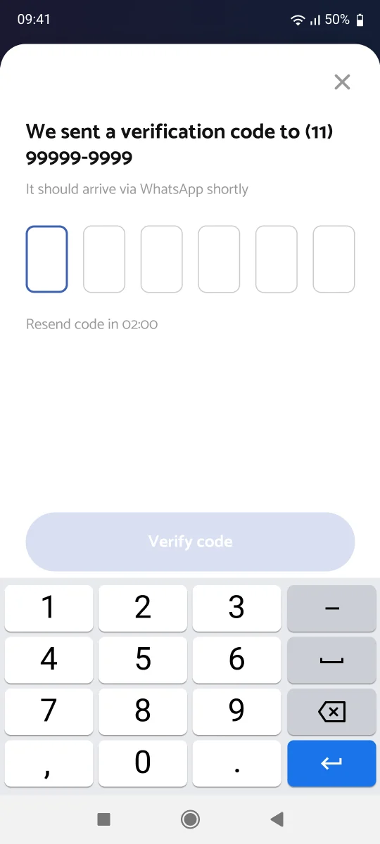
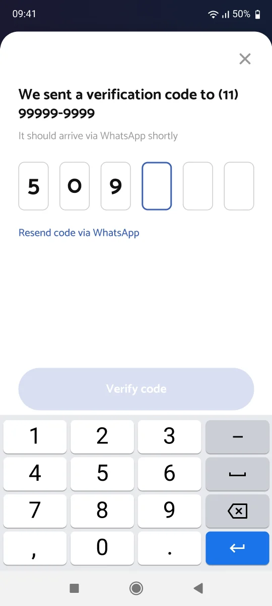
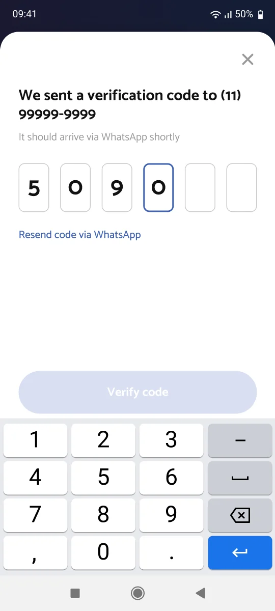
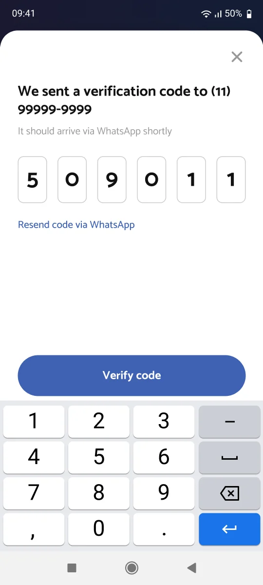
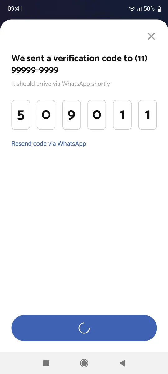
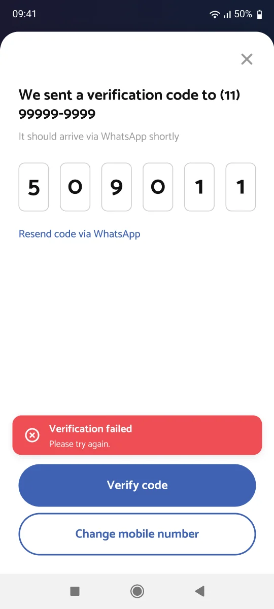
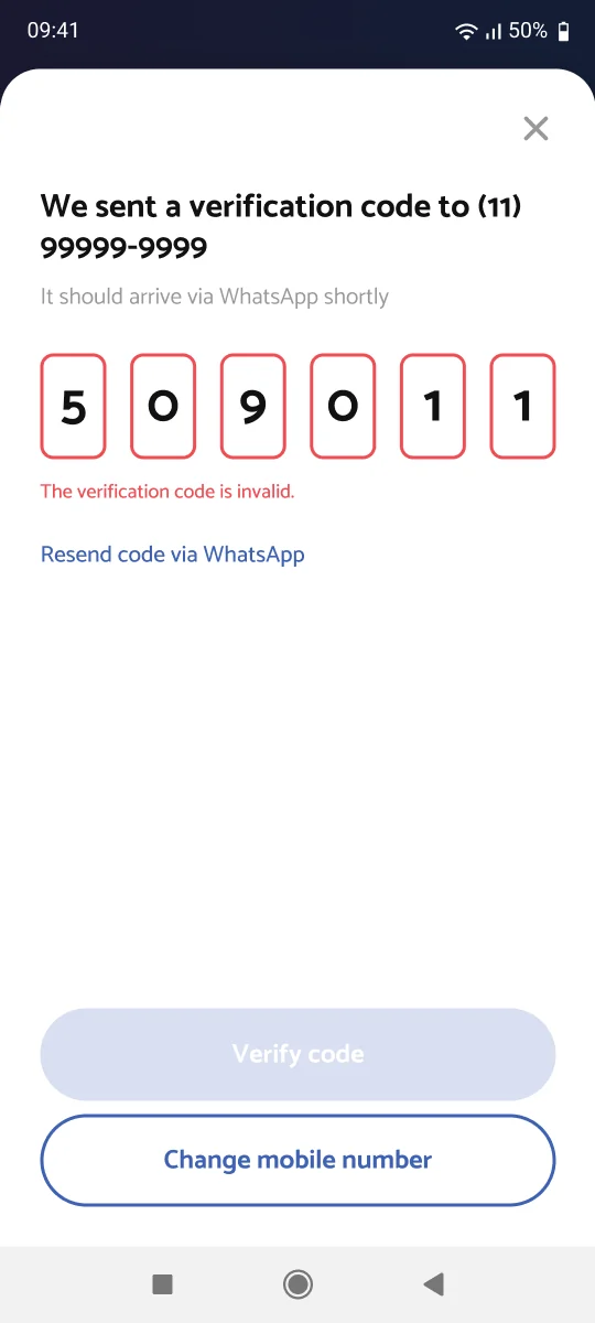
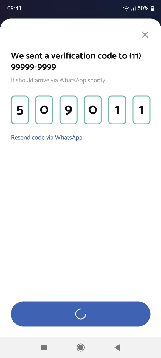
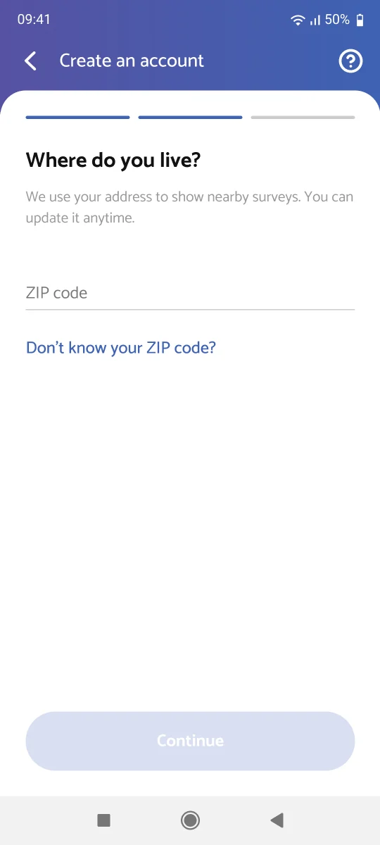
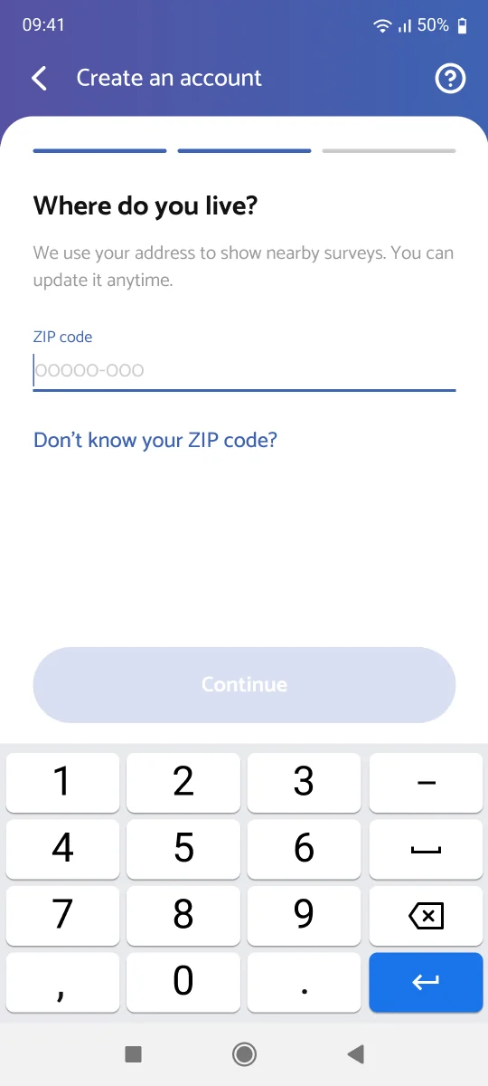
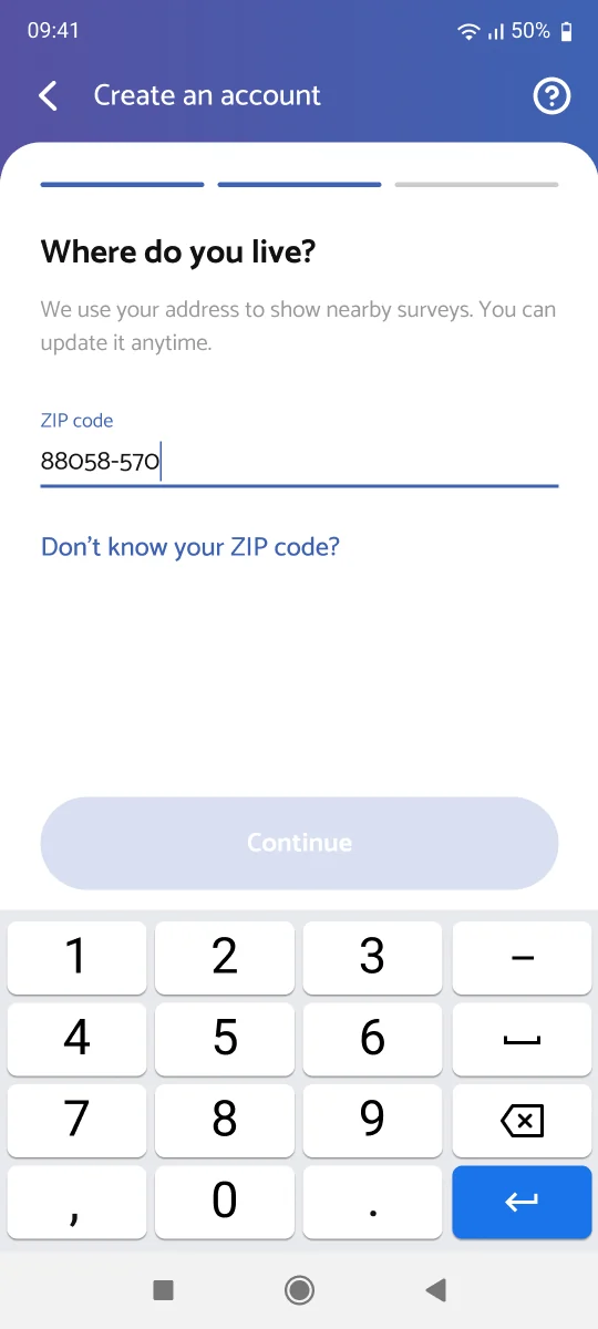
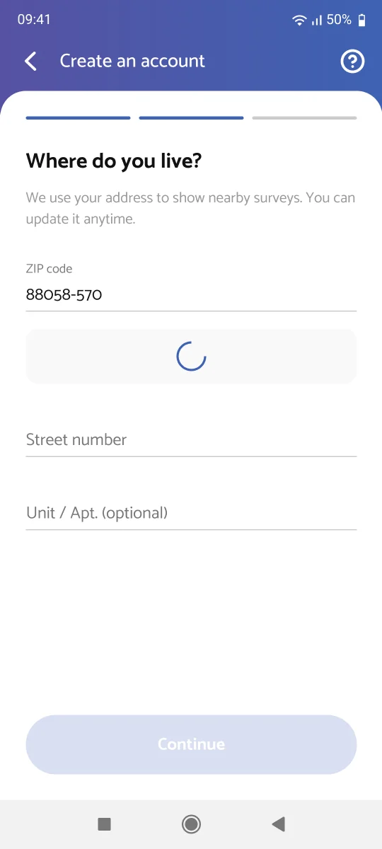
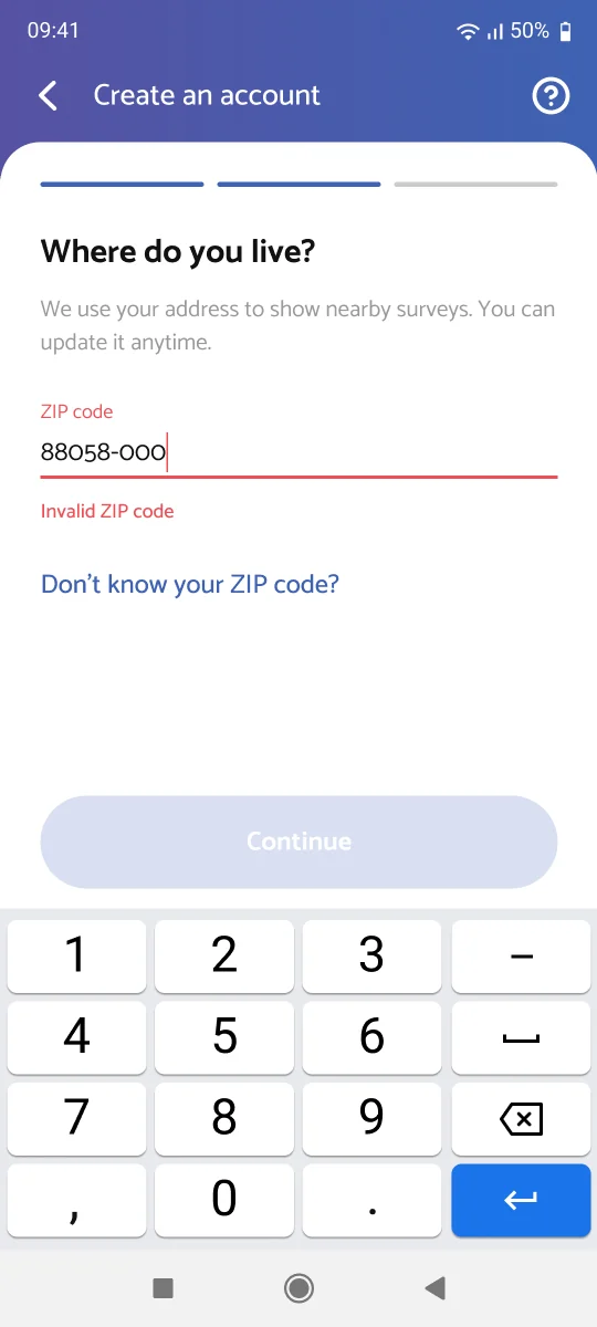
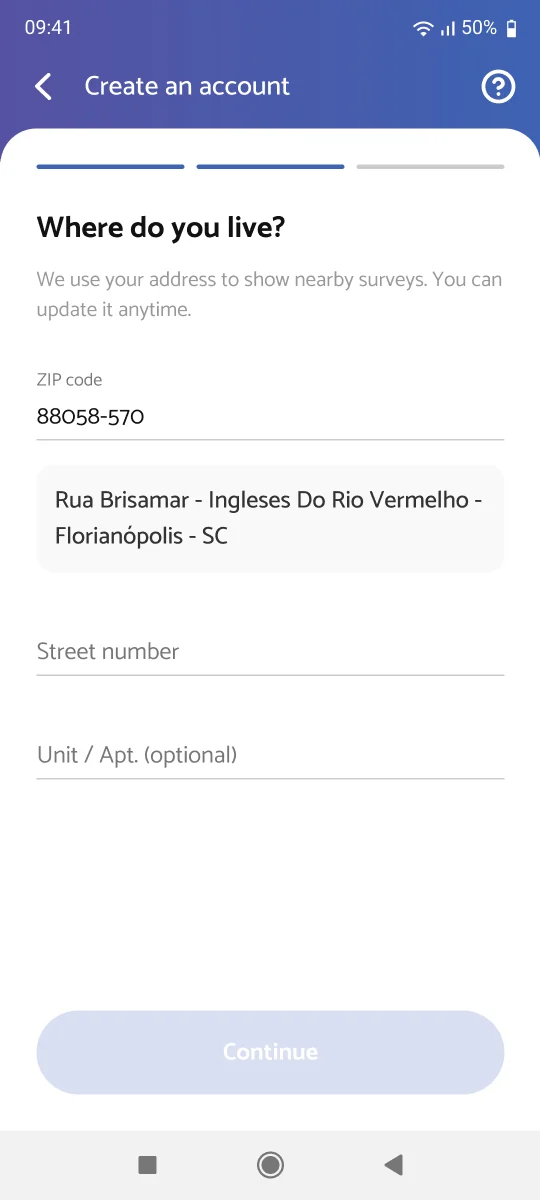
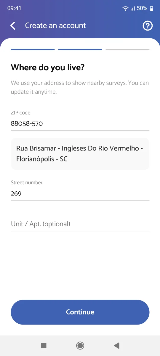
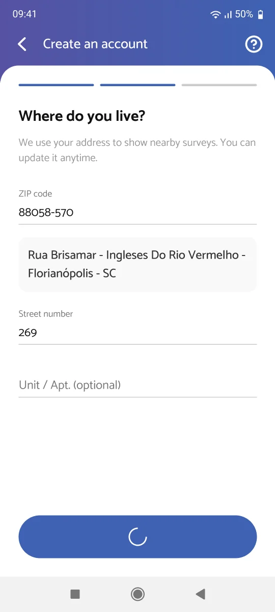
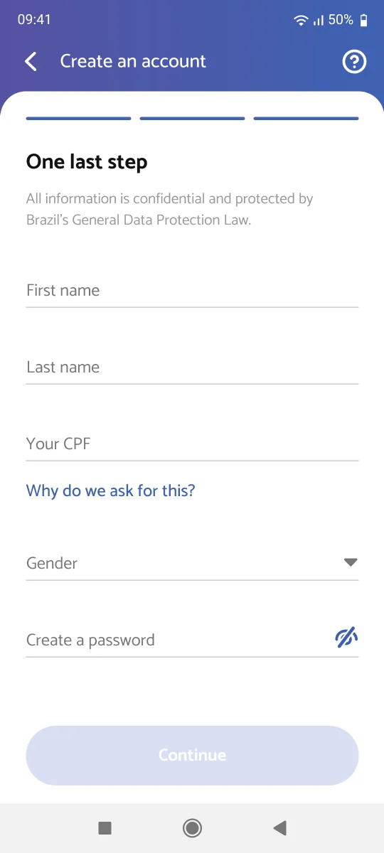
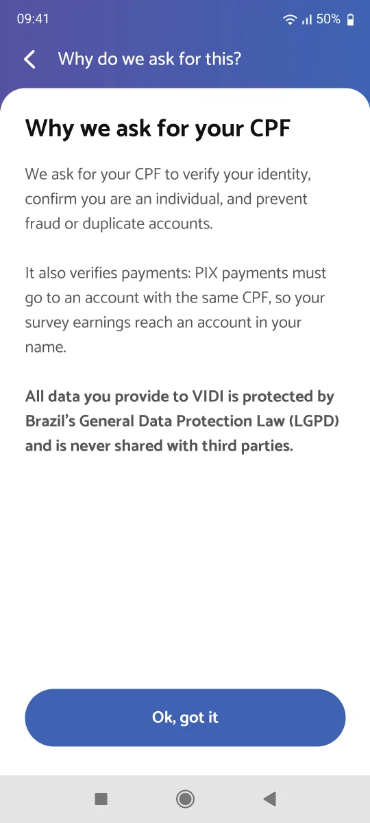
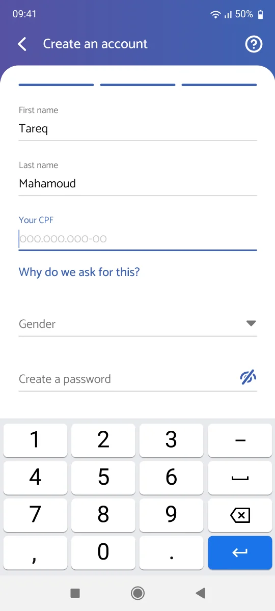
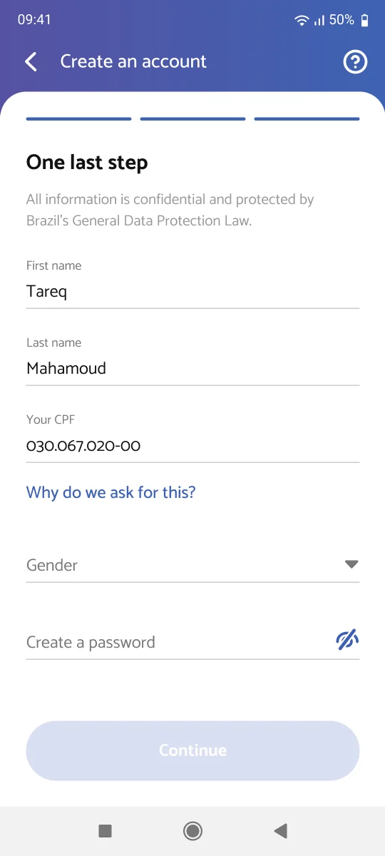
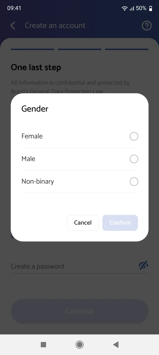
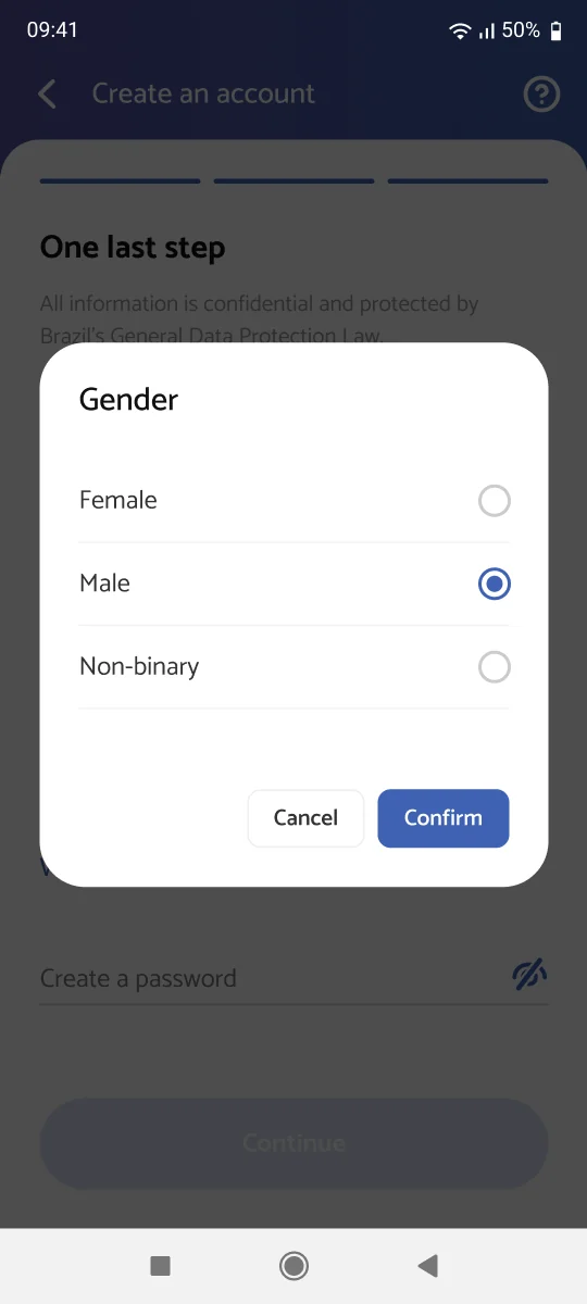
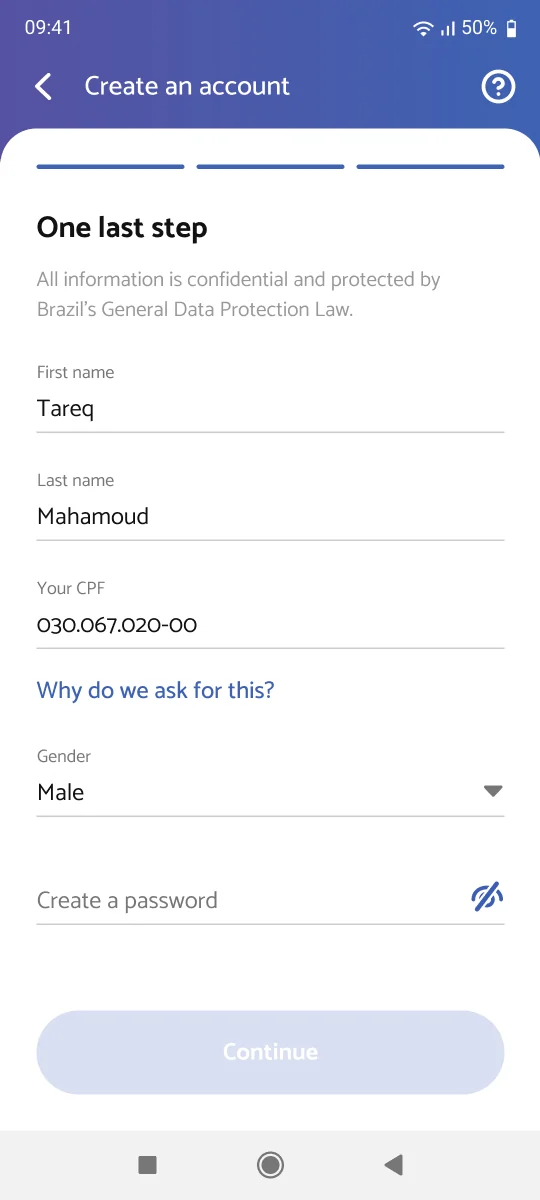
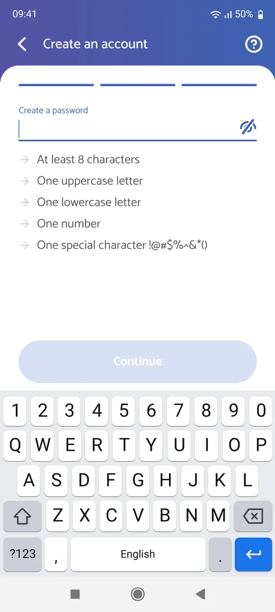
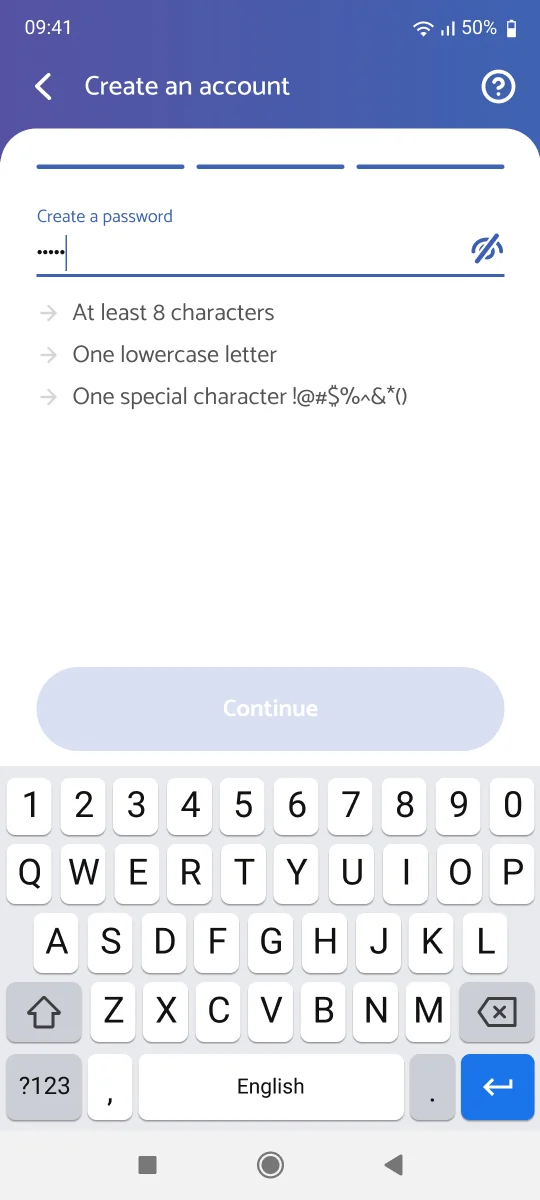
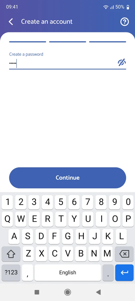
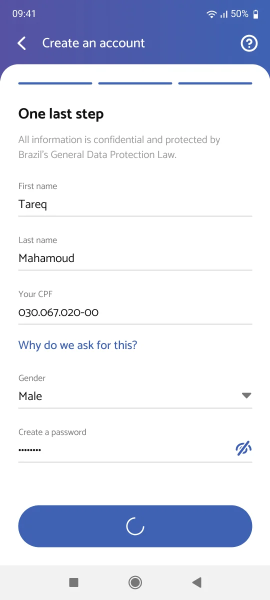
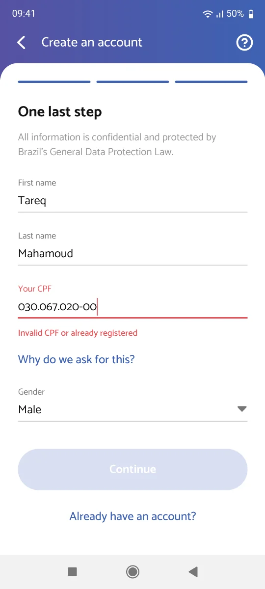
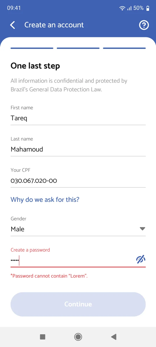
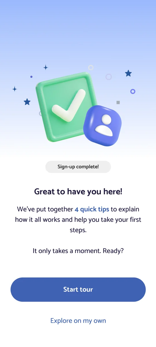
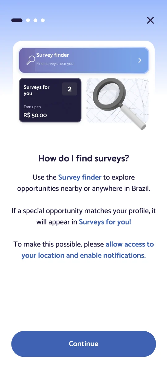
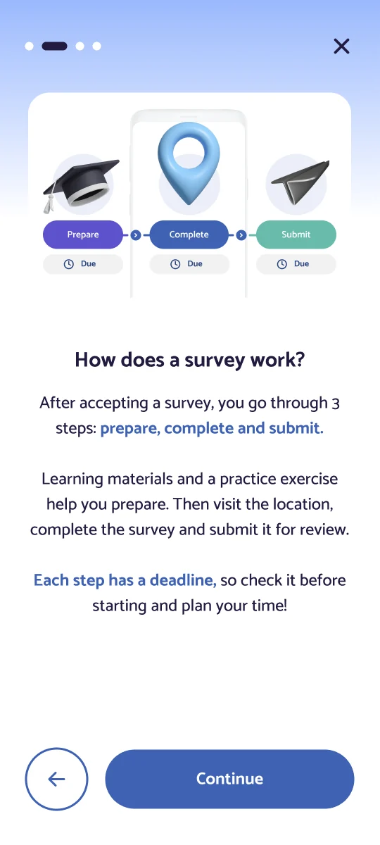
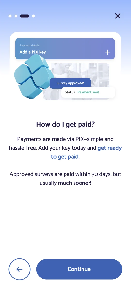
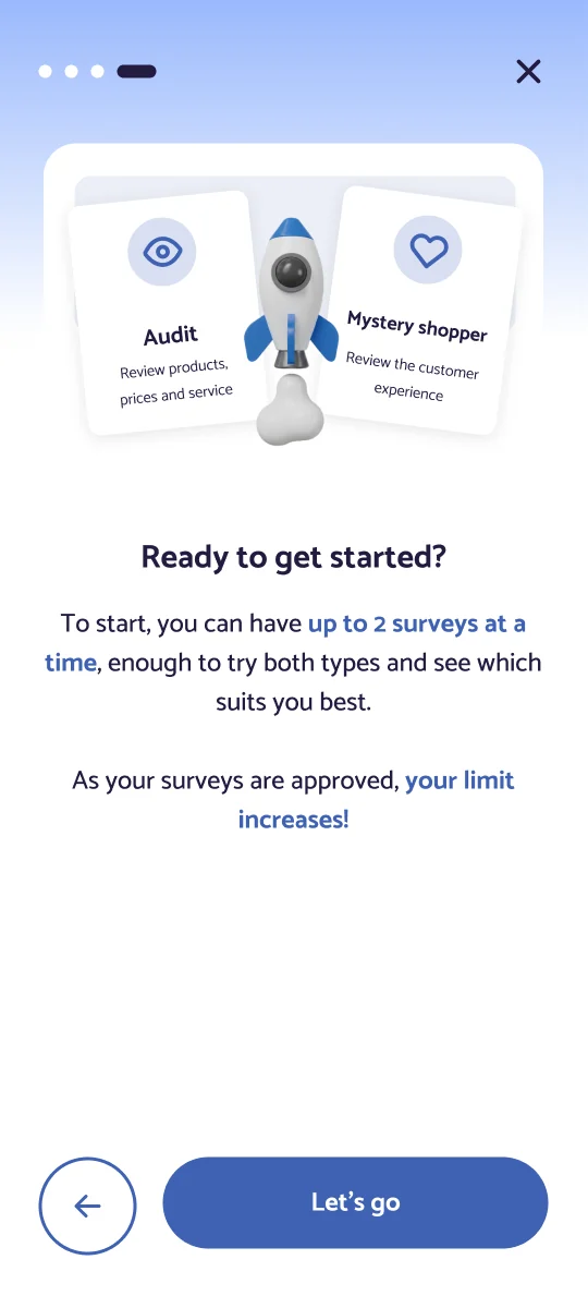
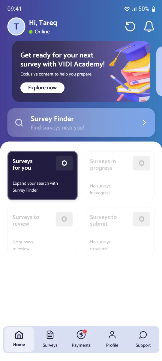
fig 2. the full phased flow — drag to scroll
Firebase showed the gap between downloads and completed sign-ups. Clarity showed where it happened: most people opened the first screen, scrolled through the form and left.
The old flow had four stages:
Stages 3 and 4 were skippable, but almost nobody got that far.
Firebase
daily downloads vs. completed sign-ups
| Stage | People | Change from previous stage |
|---|---|---|
| 01 · A scrolling form with 10 required fields | 12,480 | — |
| 02 · Terms of use | 4,720 | −62% |
| 03 · Extra profile information | 1,040 | −78% |
| 04 · A selfie | 300 | −71% |
Many new users are just curious. They’ve heard they can earn extra money and want to see what it’s about. They haven’t decided to commit, and a 10-field form asks for commitment before giving anything back.
VIDI, on the other hand, can’t let people in with no identity checks. One fraudulent visit can compromise a major brand’s data.
I mapped every field in the old flow and split it into two groups with the team:
Data that’s legally or operationally required before someone can register.
Data that helps us match people to opportunities or allow them to take surveys.
The second group moved out of sign-up entirely and became part of a new profile-completion experience.
See profile area case
Adding Google sign-in did two things at once:
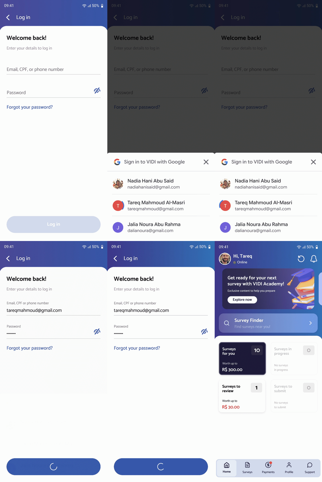
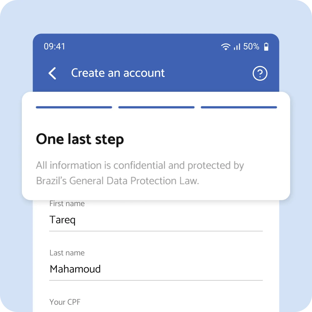
The essential data stayed, but the experience around it changed:
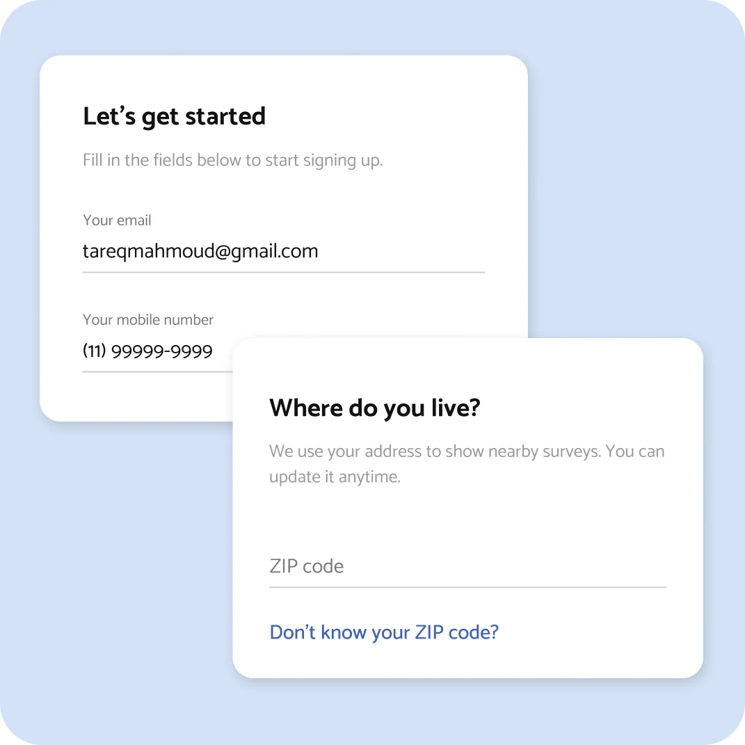 1
One topic per step instead of one long scroll.
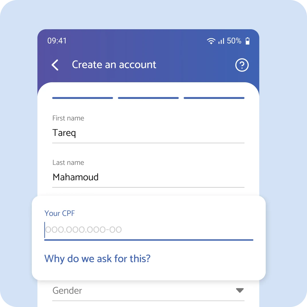 2
A short access point to the explanation of why we ask for things like CPF, so sensitive data feels justified, not invasive.
 3
Clear progress, so users know how close they are.
My original proposal was an Airbnb-style social-only sign-up: get in with Google, browse surveys, and complete your profile only when there’s something worth doing.
This addresses one of VIDI’s core pains. We can’t guarantee surveys in every town, so someone in a small rural city could complete the whole sign-up only to find nothing available.
It wasn’t technically possible at the time without reworking core parts of the backend, so we shipped the phased version. It remains the next step I’d push for.
Sign-up completion, measured as completed sign-ups per daily download.
New accounts a day.
More sign-ups, while still collecting the identity data the business depends on to operate.
Shortening a form is not the only answer. Asking at the right moment, with a reason, works too.
We still ask for sensitive data. We just stopped asking for all of it at once and started explaining why.
Adding an extra layer of security without turning verification into a frustrating extra step.