Problems
Frontline teams had no single tool connecting them to their managers. The product had to cover dashboards, news feed, task management and tracking, built from scratch.
Store associates, field technicians, warehouse staff: most of the workforce in large Brazilian companies doesn’t work at a desk. Yet the tools they get to receive tasks, news and instructions are usually built for people who do.
TaskCheck set out to change that: an all-in-one SaaS platform connecting frontline workers and their managers, so distributed teams could communicate, stay engaged and get work done in sync.
When I joined, there was no product yet. I led product design from the first research to the launch on both app stores, working closely with the product manager and the development team.
Frontline teams had no single tool connecting them to their managers. The product had to cover dashboards, news feed, task management and tracking, built from scratch.
A hybrid platform: a cloud-based web app for managers and a native app for employees, built on a shared design system and validated with real clients.
Launched on Google Play and the App Store and adopted by clients such as Carrefour, Tok&Stok, Spïcy and Essential Nutrition.
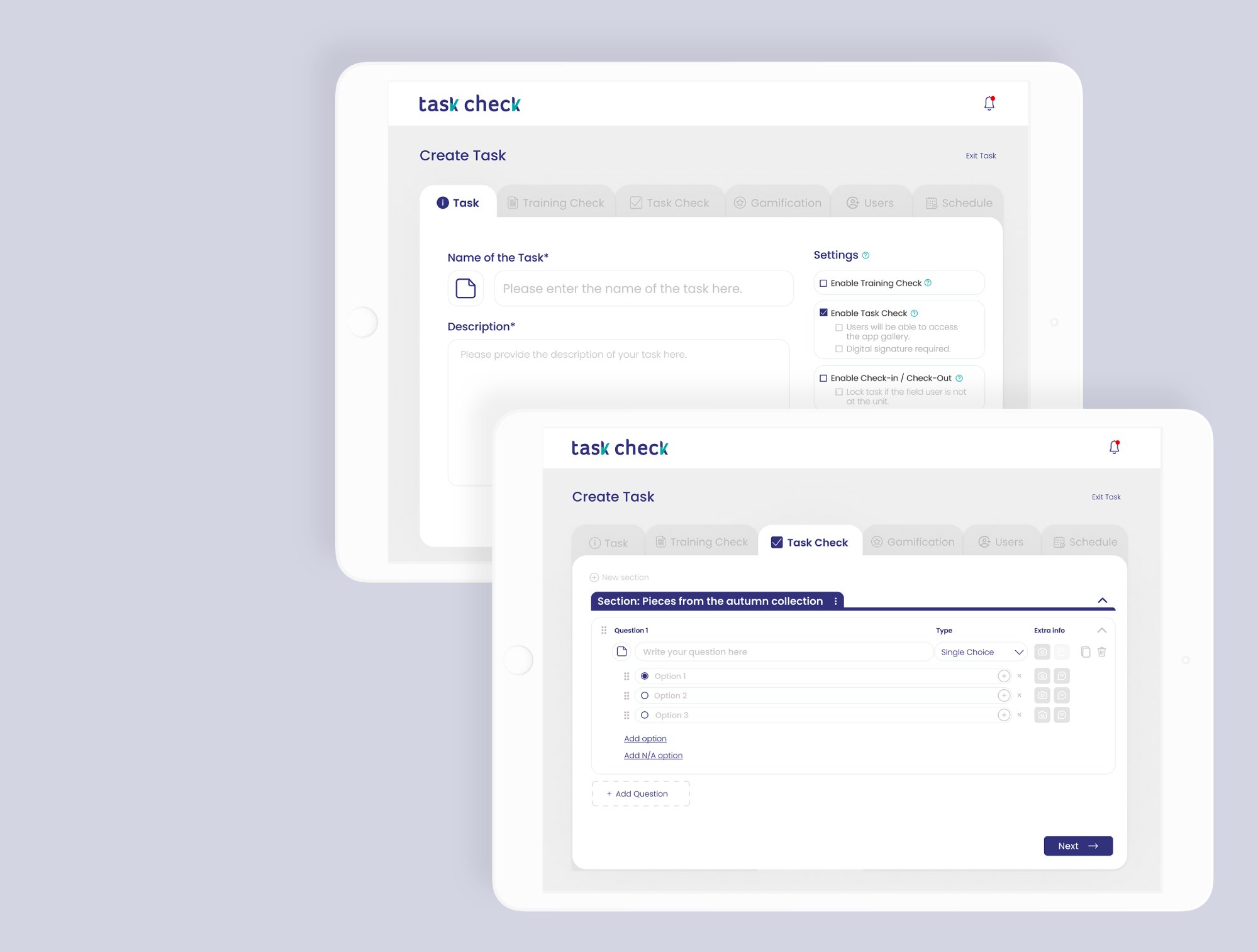
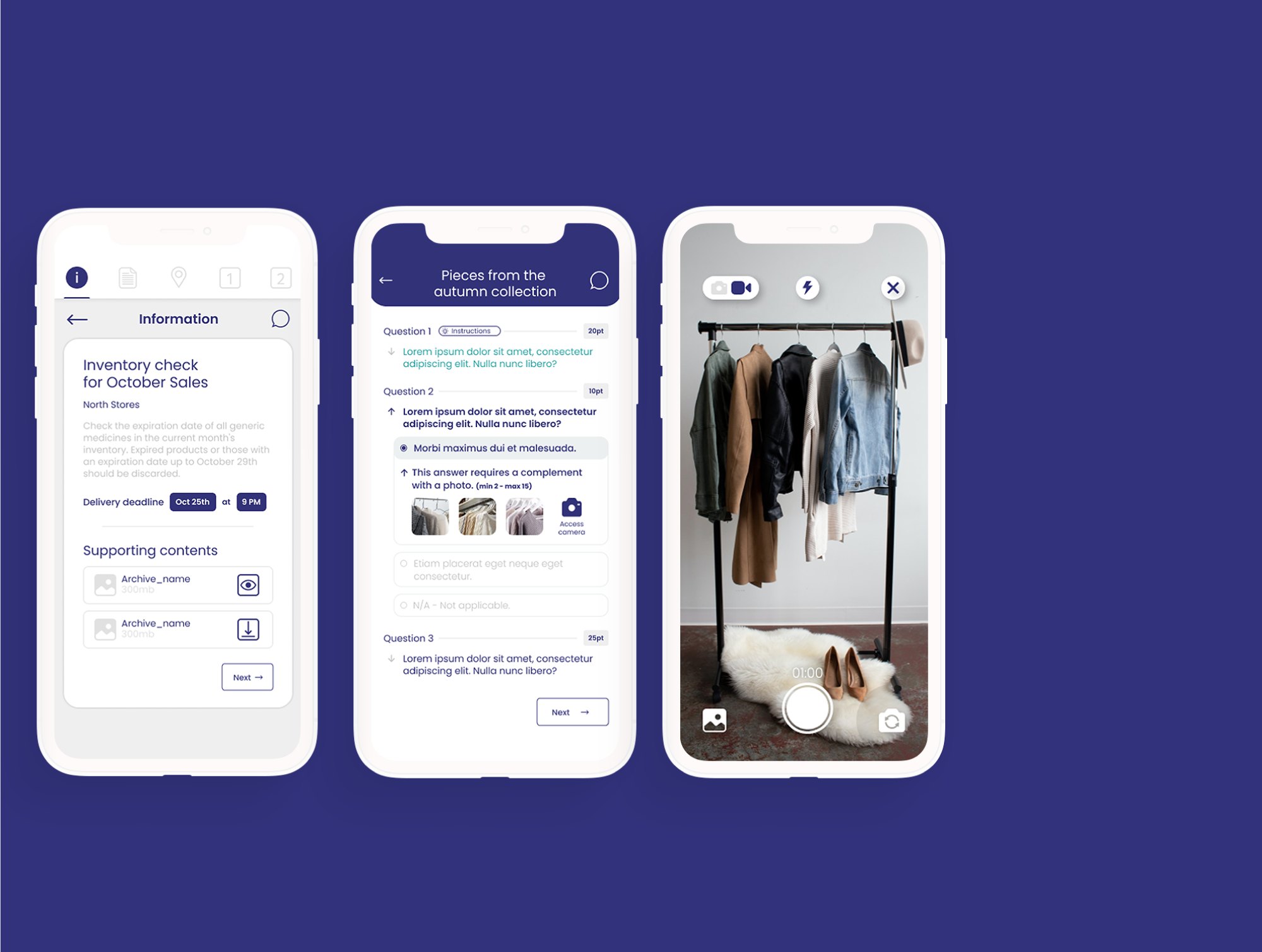
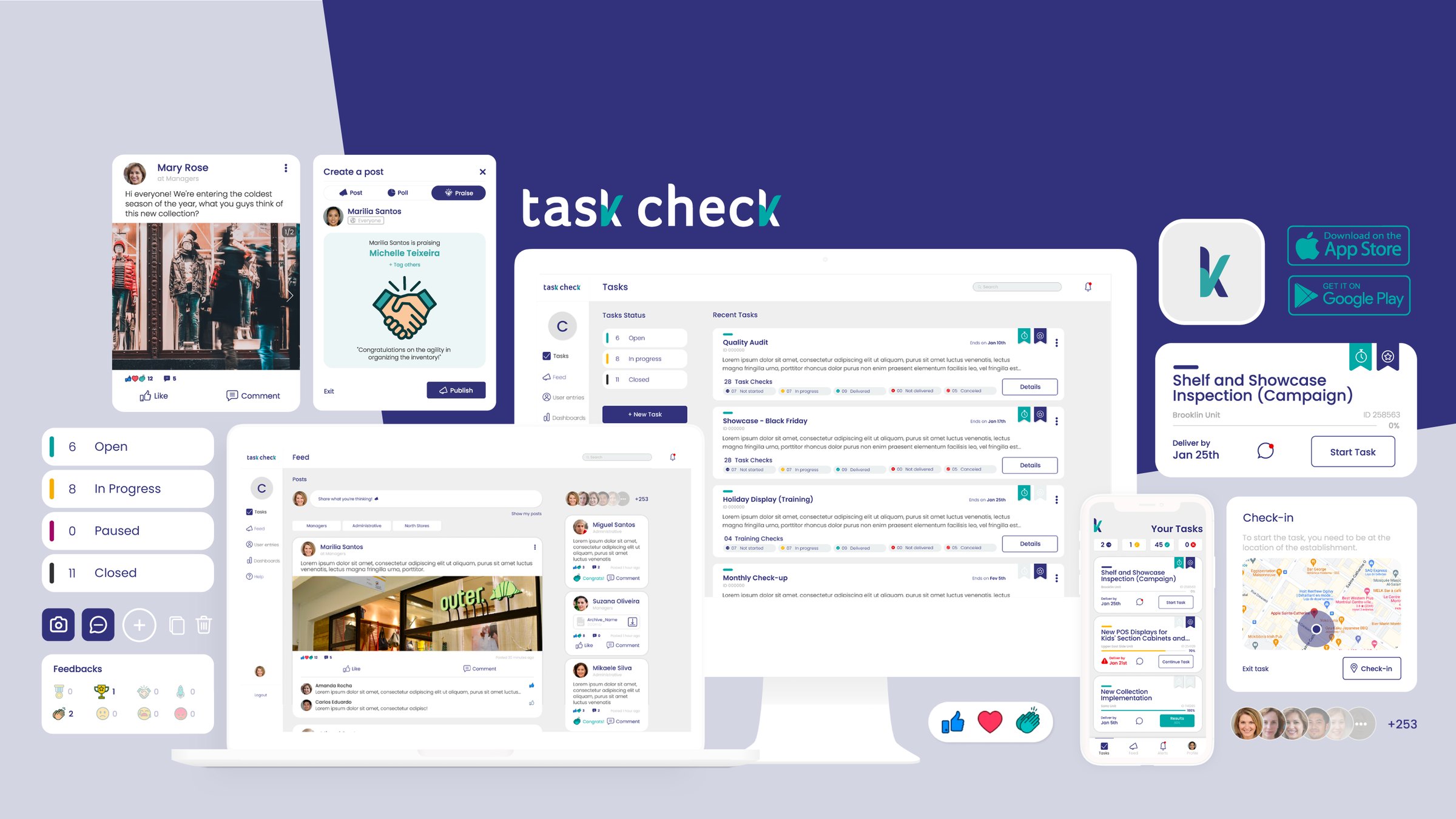
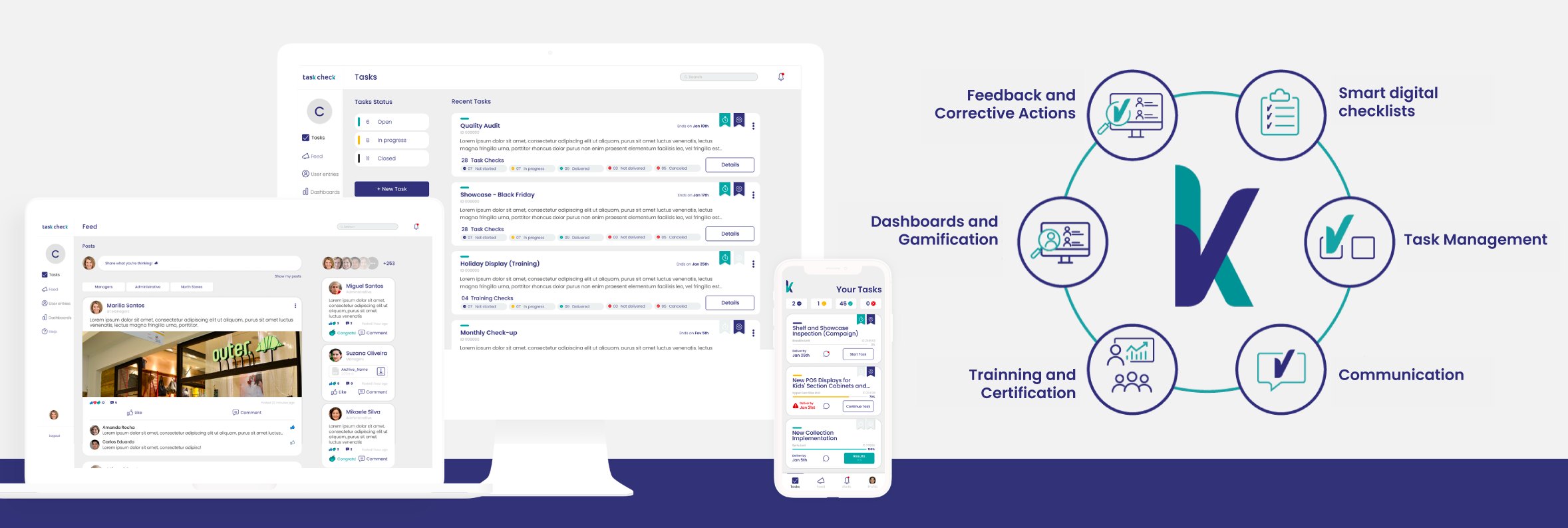
fig 1. manager view (web) and employee view (app)
Managers needed control: create tasks, track execution, read dashboards, publish news. Frontline workers needed the opposite: something fast and simple, on their phones, between one task and the next.
That shaped the architecture from day one:
A cloud-based web platform.
A native mobile app.
Both had to feel like the same product and work in total sync.
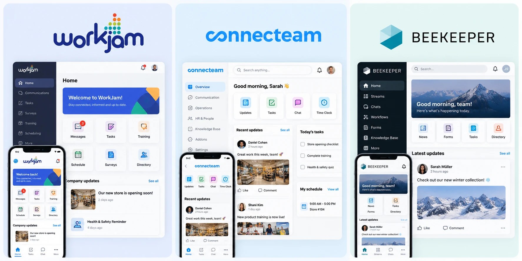
The goal was to become the first complete SaaS platform for frontline teams in Brazil, so I looked abroad: I researched and analyzed competitor software from other markets to understand which patterns worked, and which wouldn’t fit the Brazilian context. The main case studies were Beekeeper, Connecteam and WorkJam.
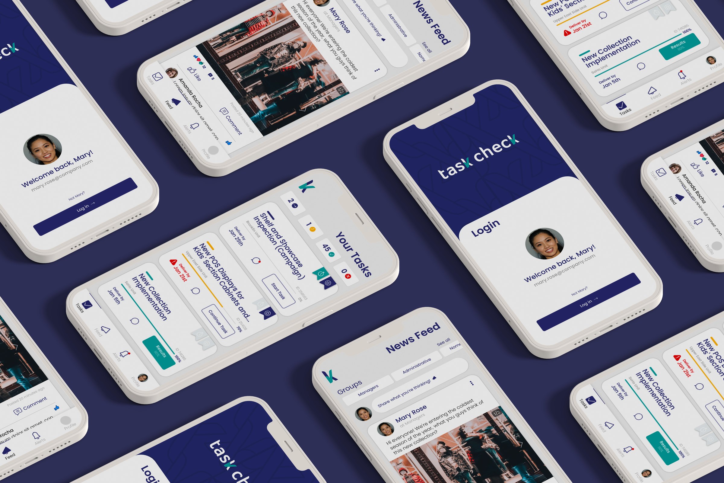
Testing with clients before launch meant the platform was shaped by the operations it was meant to serve, not by assumptions about them.
I built a design system covering both the web platform and the mobile app, keeping the two consistent while respecting how each one is used.
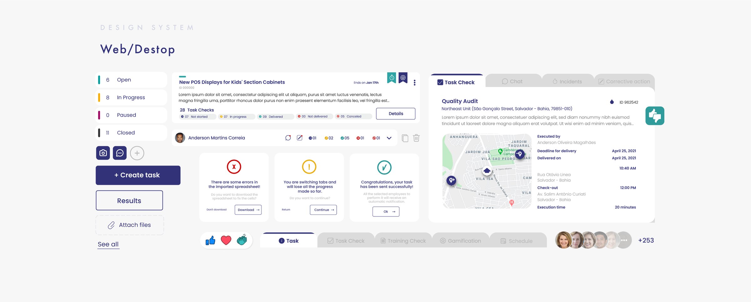
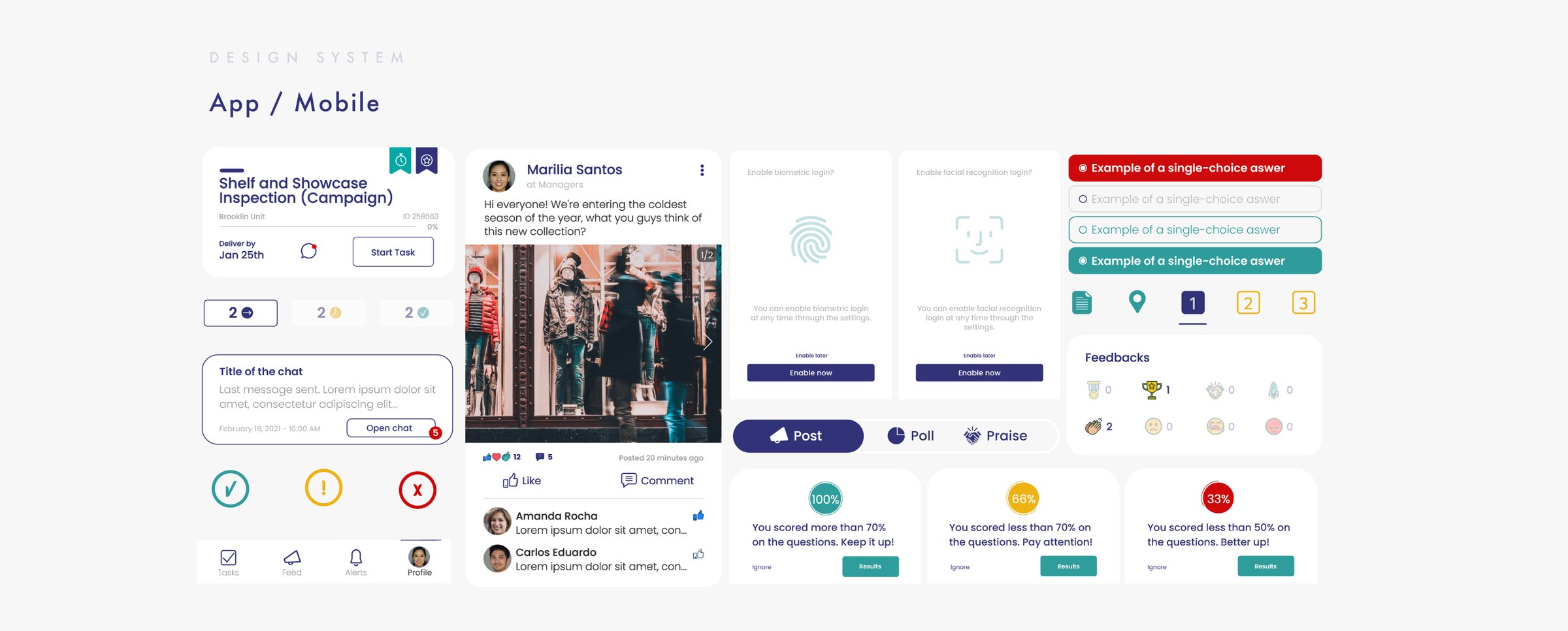
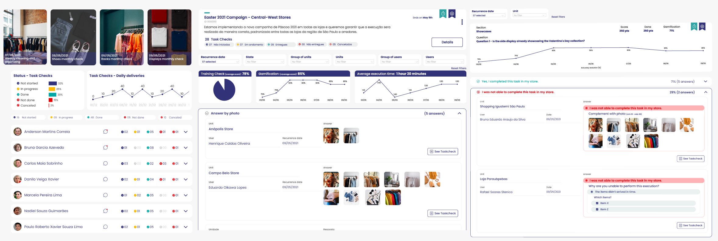
Dashboards, news feed, management and tracking panels, task creation: everything a manager needs to run a distributed team, and everything a worker needs to get the job done.
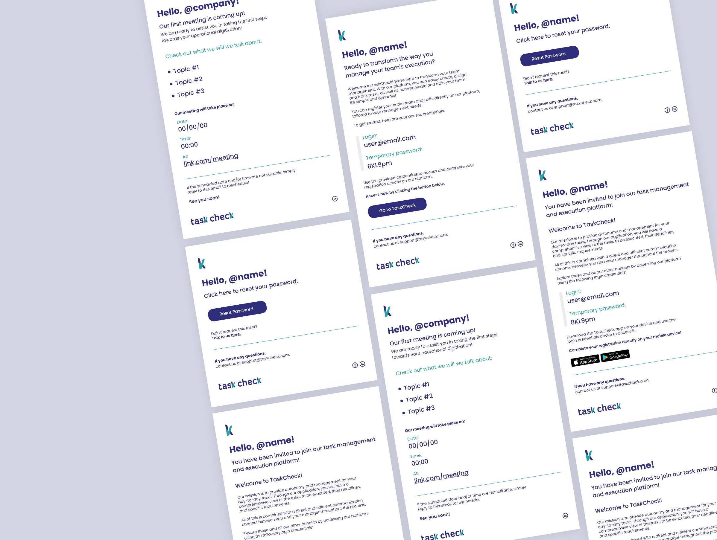
Onboarding emails to welcome new users into the product, and social media pieces to carry the brand’s message.
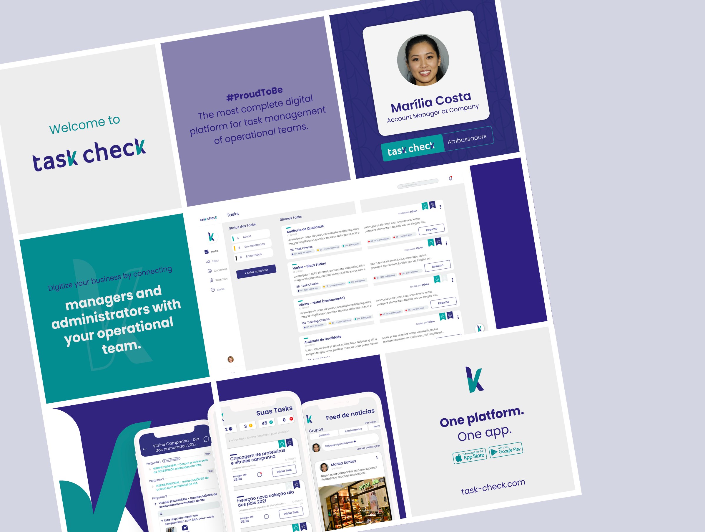
TaskCheck reached Google Play and the App Store in February 2022 and attracted clients such as Carrefour, Tok&Stok, Spïcy and Essential Nutrition.
Despite its early traction, TaskCheck faced challenges in its investment rounds, and the company decided to discontinue its operations.
Much of what was built still informs the founders’ other ventures, and it shaped how I approach complex, multi-user products today.
Designing for two users at once means designing two experiences that share one truth.
Managers and frontline workers needed different interfaces, but the same information, in real time. The design system was what held that together.
Hand-drawn illustrations and a message on each package for Búfala Almeida Prado.