Problems
Buffalo dairy is less common and more expensive in Brazil. The packaging had to justify the price and stand out against cheaper competitors.

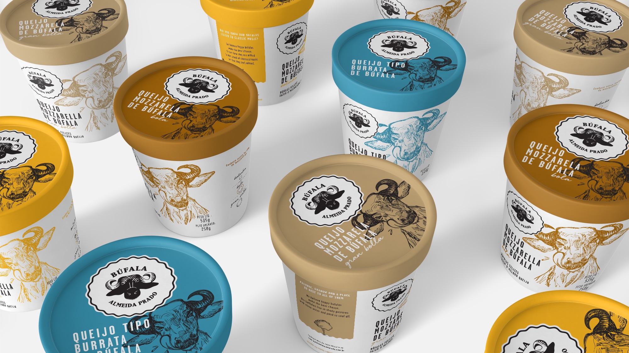
Búfala Almeida Prado started with a mother trying to feed her children, who couldn’t drink cow’s milk. A few buffaloes on the family farm became the answer, and over the years that answer became a business, selling artisanal buffalo cheese to renowned restaurants and supermarket chains in São Paulo.
The products had grown up. The packaging hadn’t. It needed to carry everything behind the cheese: the family, the craft and the way the animals were treated.
I worked on this project as part of the design team at DZN, and I signed all the illustrations on the packaging.
Buffalo dairy is less common and more expensive in Brazil. The packaging had to justify the price and stand out against cheaper competitors.
Built the packaging around the founder’s story, with hand-drawn illustrations, a unique message on each package and a palette designed for the shelf.
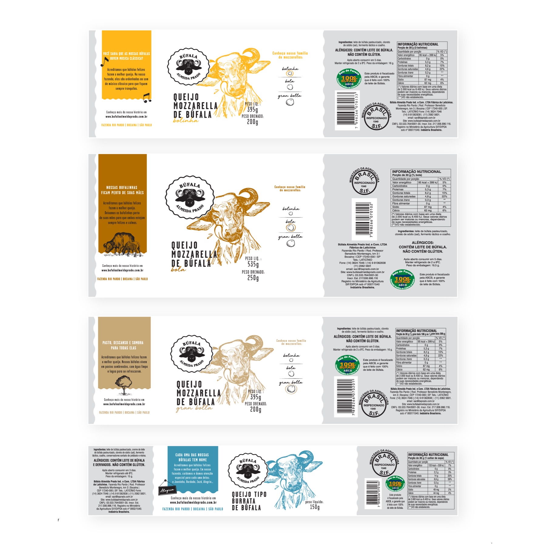
A packaging line for the full range of four products, each carrying a piece of the brand’s story.
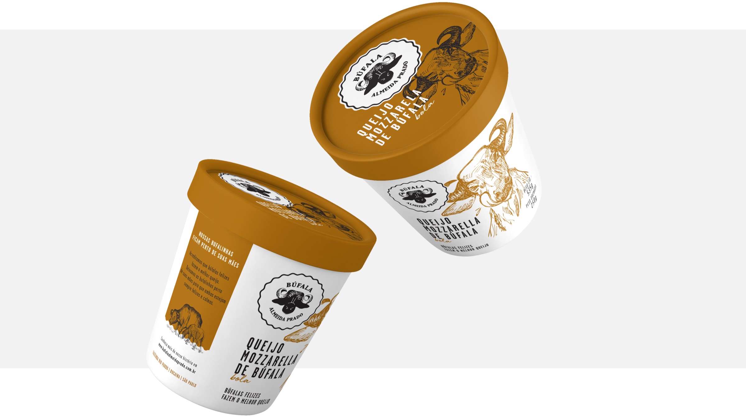
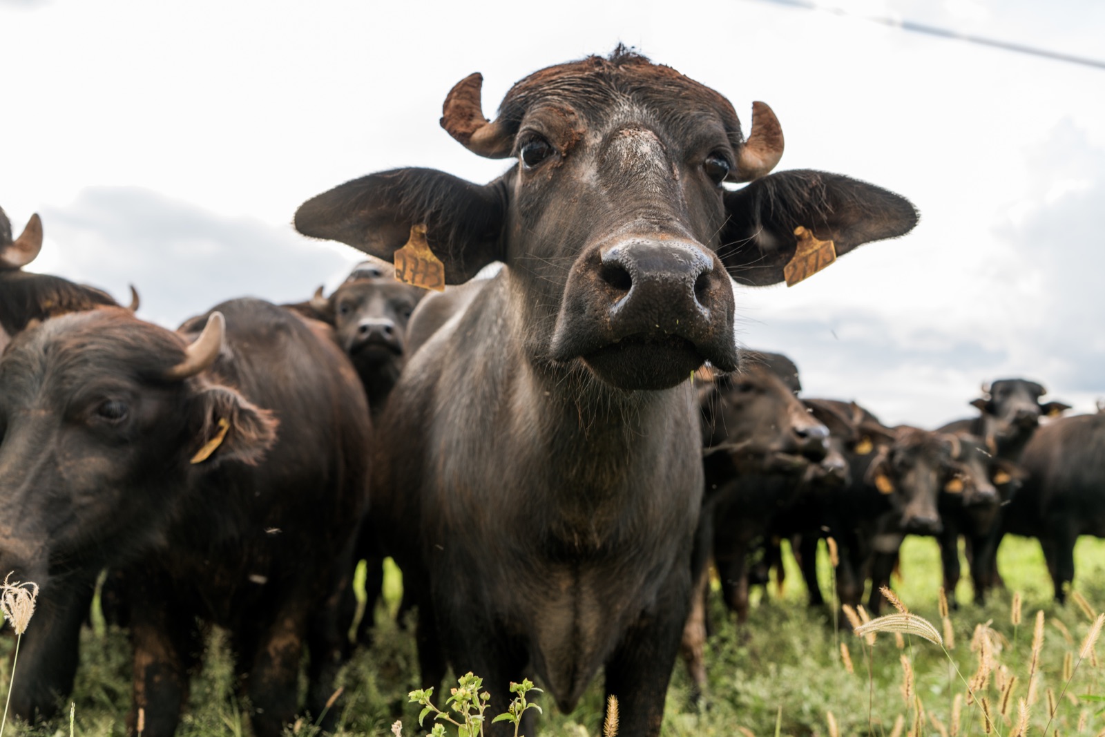
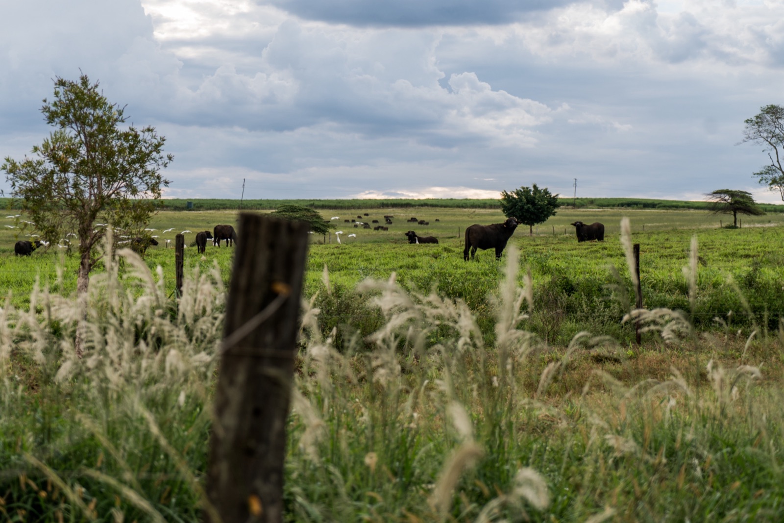
Photo credits: @eltoledo_
In Brazil, buffalo dairy is less common than cow’s milk products, mostly because of its higher price. Shoppers comparing two mozzarellas side by side needed a reason to pick the more expensive one.
So presenting a nice concept wasn’t enough. The packaging had to communicate the company’s heritage and the quality of its products in the few seconds someone spends looking at a shelf.
We set two goals:
Stand out in the market with a positioning built on its values.
Be noticed on the shelf, with packaging that tells the brand’s story.
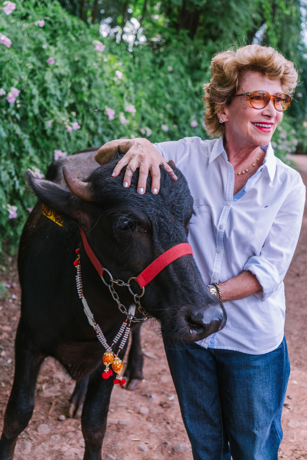

A mother looking for healthier milk for her allergic children. A few buffaloes that slowly became a herd. Children who studied artisanal cheesemaking abroad and brought those techniques home.
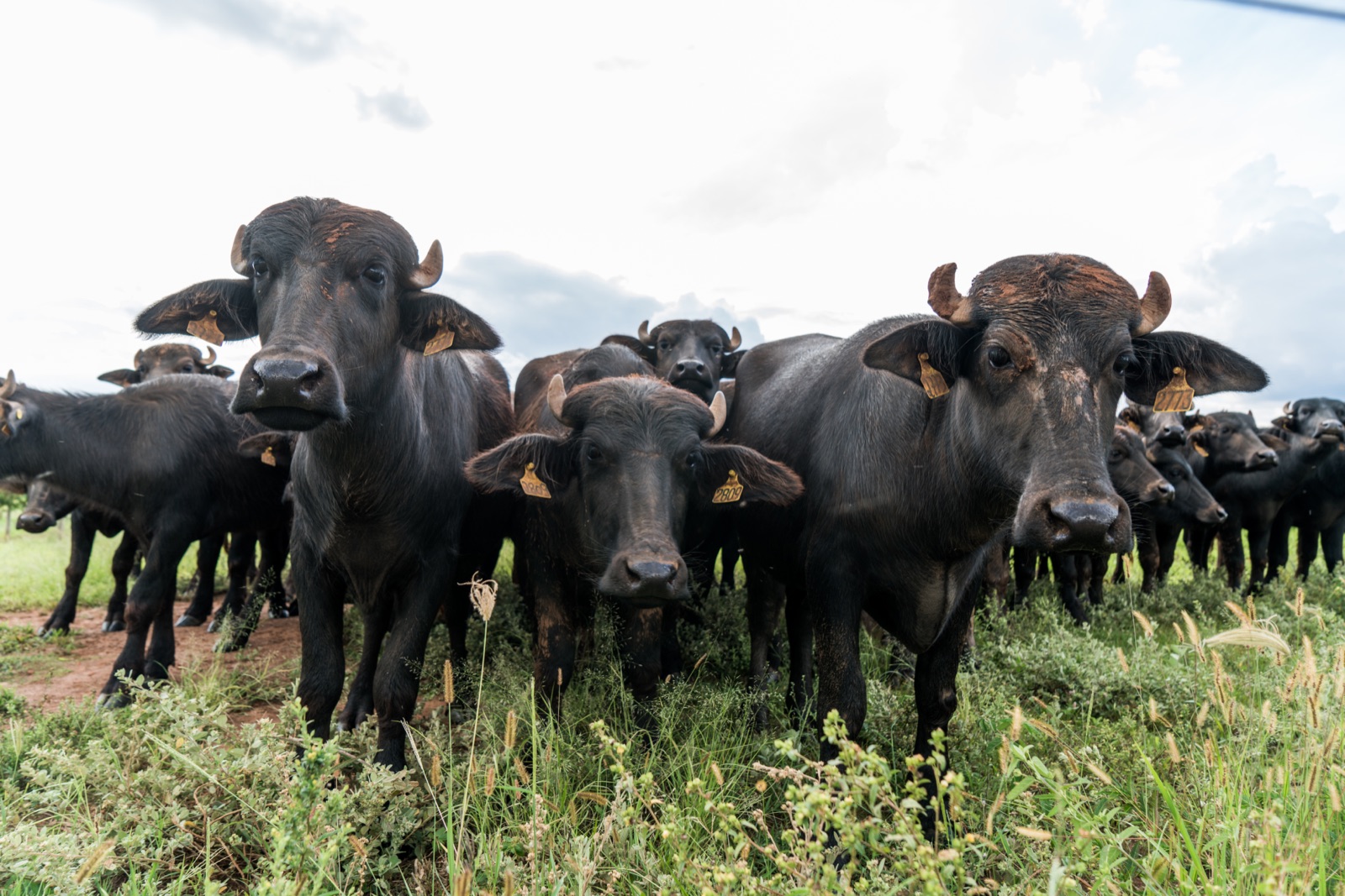
And above all, an unusual level of care for the animals: calves were never separated from their mothers, and the buffaloes were milked to classical music.
When asked about the cost of all that care, the owner answered with the sentence that became our statement:
“We believe that happy and healthy buffaloes produce the best milk!”
Instead of repeating one message across the line, every package carries an individual message and illustration. Together, they tell the brand’s story; on their own, each one gives the shopper a reason to pick it up.
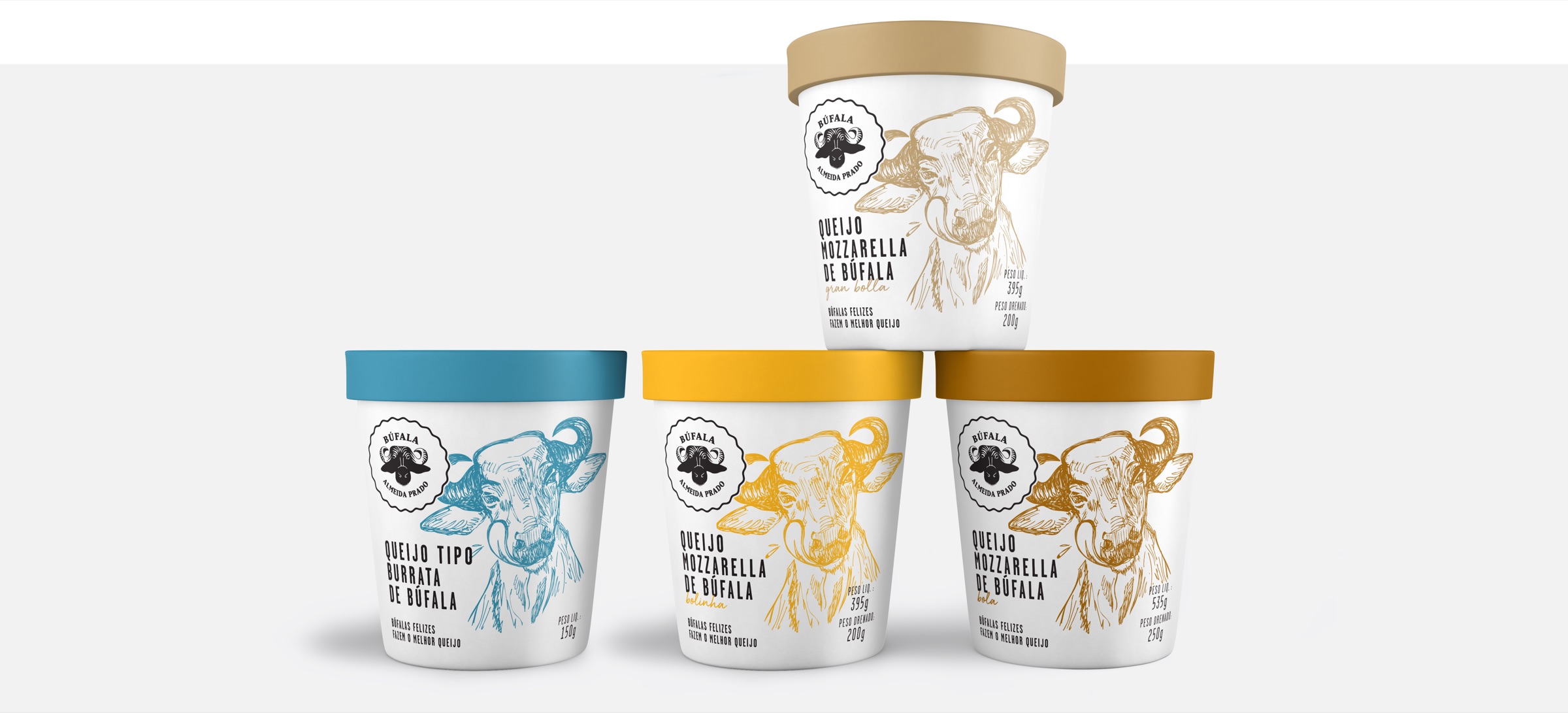
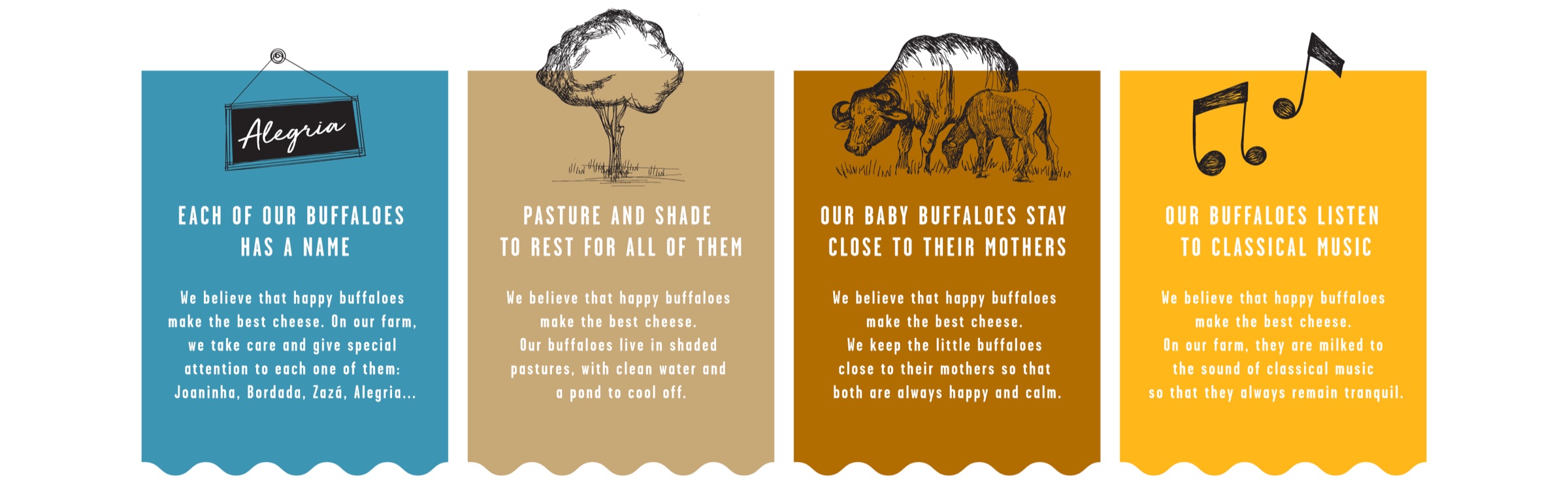

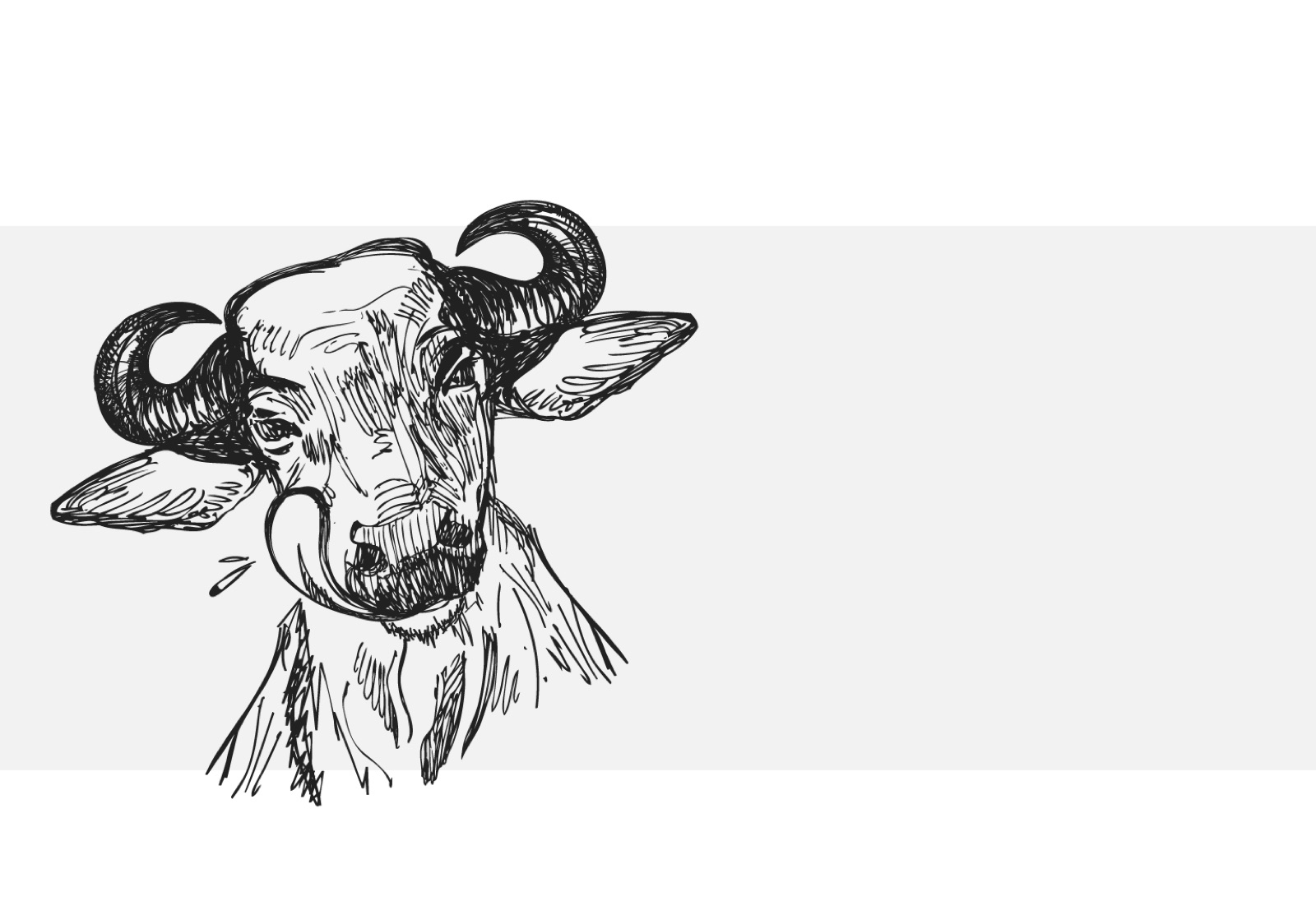
I drew them as gentle, approachable characters, matching the way the family actually treats them. The rustic, hand-drawn lines also carry the idea of craftsmanship, mirroring how Almeida Prado’s cheese is made.
The palette had two jobs: stand out among competitors and reinforce the brand’s values.
We designed packaging for every product in the range:
Each one spreads the brand’s commitment to its animals and adds perceived value to a premium product.
The best brand story is often one the client already tells without noticing.
We didn’t invent a concept for Almeida Prado. We listened to how the family talked about their buffaloes, and turned one sentence into the whole system.
Reducing sign-up drop-offs and speeding up access with a simpler flow and Google sign-in.